Picking out white paint might seem like an easy task. I mean, it’s just white, right? Wrong. Deciding on the most basic shade is by no means as straightforward as it sounds.
From blue undertones to gray undertones, to yellow undertones, to bright whites, to dull whites, the possibilities are endless. Plus, depending on how light filters into your house (Do you have northern exposure? Southern exposure? Maybe a combo of x and y exposure? Skylights? Etc.?) paint can look totally different. Is your mind spinning yet?????
MATCHING WHITES THROUGHOUT YOUR HOUSE
I learned this lesson about white paint while picking out a color to use on our new kitchen cabinets, dining room built-in, trim and doors throughout the Connecticut ranch house we’re remodeling (and hopefully moving into in the very near future … Baby and house are due around the same time!!)
If you didn’t already know, it’s recommended that if you are getting custom cabinetry installed, your cabinets should match your trim, doors, etc. (Also something I just recently learned.)
So what I initially thought was going to be a fairly straightforward trip to the hardware store to look at Benjamin Moore samples, turned into weeks of stressful deliberation. To make matters worse, I was feeling the pressure from our cabinet company and my hubby to make a decision fast.
So what’s a very indecisive, perfectionist girl who has had to repaint rooms one-too-many-times because of her poor color choices to do?
So what’s a very indecisive, perfectionist girl who has had to repaint rooms one-too-many-times because of her poor color choices to do?
Don’t worry, I’ll get to that…
I was making my decision mainly based on the kitchen cabinets because they take up the most amount of real estate. I was convinced that I wanted true white cabinets but didn’t want them to look too stark, in-your-face, hospital-grade white.
And so my quest began…

SIMPLY WHITE
Initially I walked into the hardware store thinking Simply White (OC-117) was the way to go. I saw pictures of it online and it looked pretty. After all, it was named Benjamin Moore’s 2016 Color of the Year and people rave about it.
We picked up a booklet of the paint brand’s Gentle Whites, which contains all of their off-white paint colors, including Simply White. But upon first glance, I said, “Oh hell no.”
It looked yellow. Granted, the color in the Gentle Whites booklet did seem more saturated than the other paint chips we looked at. But I knew it wasn’t the one for us so we put the kibosh on it almost immediately.
CHANTILLY LACE
Next, we considered Chantilly Lace (OC-65). Walking out of the store, I was convinced that was the white we’d be going with.
But in traveling down the rabbit hole known as Houzz, I eventually determined by people’s posts that it might be too bright. We held it up to our current white Ikea cabinets, that err on the side of cream and it definitely looked white.
It’s also said to have cool undertones which, honestly, I couldn’t see with my naked eye. However, I didn’t want to take the risk since I’m a fan of warmer grays, wood tones, etc., and a bluish-white wouldn’t complement that style.
 SUPER WHITE
So then I moved on to Super White (OC-152, also known as PM-1). Third times a charm, right? I was set on this color because it is said to have neutral undertones, meaning it can go with any paint we choose to put next to it on the wall.
If you didn’t know, certain whites can bring out undertones in other paints. So you wouldn’t want to use a yellowish white next to, say, a bluish gray.
Speaking from experience, the “greige” paint I picked out when we recently made over our condo kitchen, looks like lavender on the wall next to our off-white Ikea cabinets. The color snafu could also just be due to me picking out the wrong gray, but regardless, I was too lazy to repaint the room and decided to live with it until we move.
But back to my quest for white…
 WHITE
WHITE
I soon convinced myself that Super White (probably because of the name) would be super bright, and moved on to Benjamin Moore’s White (OC-151, also known as PM-2).
Despite looking grayish white on the paint chip, I convinced myself that in our house it would just look white, but not too bright. Mainly, it’s because I kept going back to this post on HomeBunch of a Cape Cod house that featured BM White cabinets, trim and built-ins, and this post on Remodelista of a country house makeover. Both look pretty white to me, wouldn’t you say?
Benjamin Moore’s “White” looks very similar to another popular choice for cabinets, Decorator’s White (OC-149, also known as PM-3). In fact, it’s the color our builder typically uses in homes. However, he tends to lean towards cooler gray wall colors and said it reads a little blue, which is the look he prefers.
NARROWING THINGS DOWN (KIND OF)
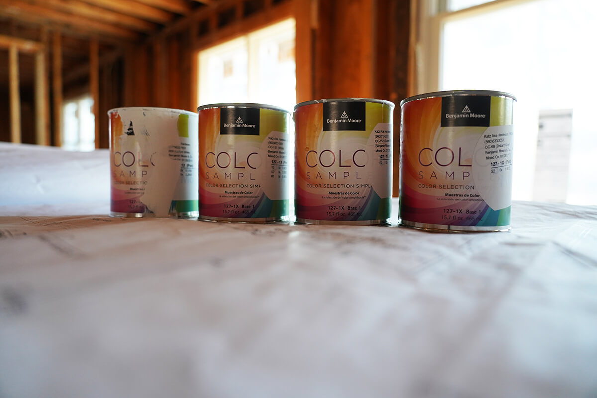
So after going through several other white paints, as well as speaking to the color expert at the hardware store a couple of times, I decided my best bet would be to narrow things down to four paints, get samples of each, and paint them on big poster boards. So I did just that with the help of my hubby. (Luckily, Benjamin Moore sells sample pints for around $8)
The four colors I chose were:
- Super White
- White
- Oxford White (Yeah, I know, not even mentioned above)
- Distant Gray (Also a last-minute wild card – I’m really good at “narrowing things down,” eh?)
With poster boards in tow, I went to our future house to look at them in the light of day. And guess what? They all kinda looked the same!
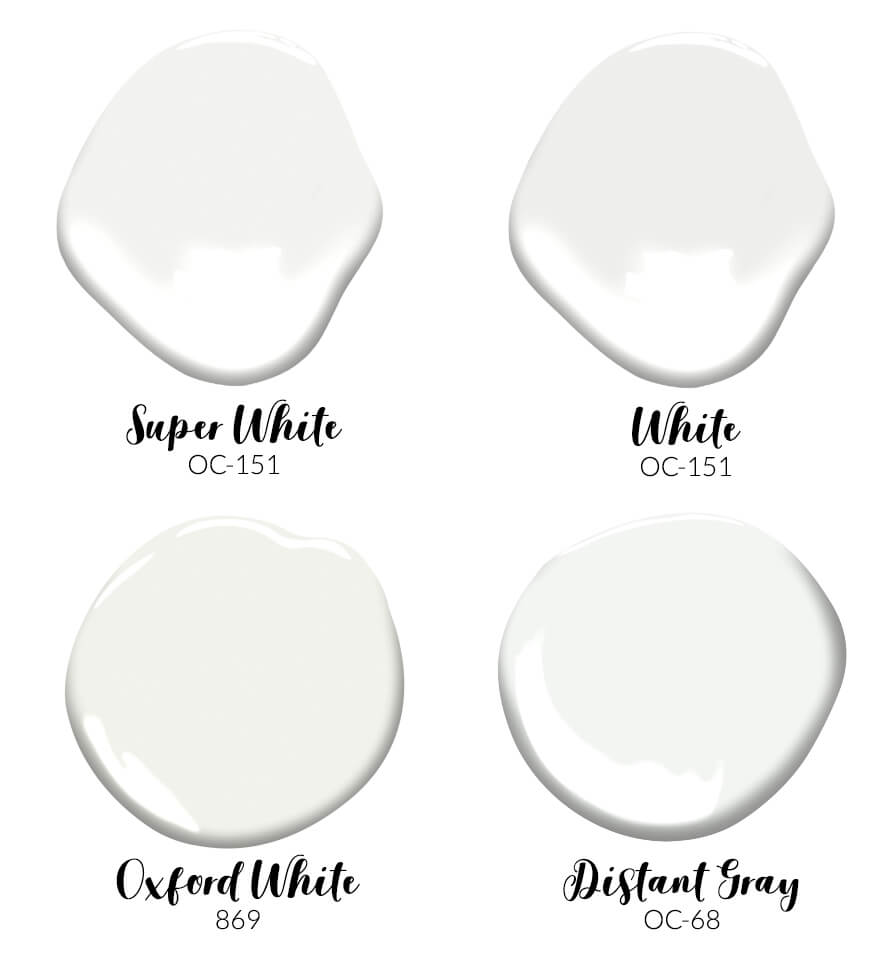
Well, sorta. I could see the gray in White, as well as the green undertones in Oxford White (869). And despite its name, Distant Gray (OC-68) showed no signs of gray and actually looked pretty close to Super White – maybe a teeny tiny bit darker. It was a nice color.
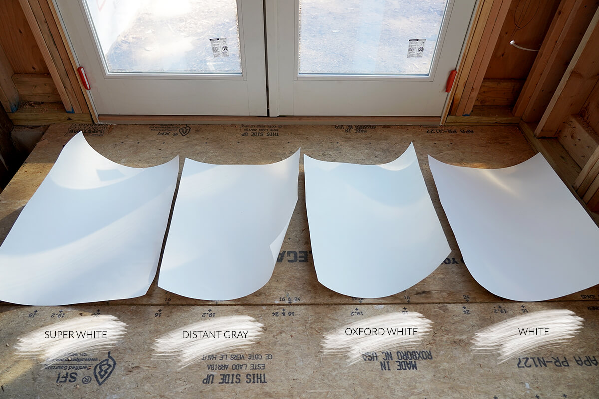
In addition to painting the poster boards, I also painted the four colors on the back of an Ikea bookshelf to see how they read in our condo. In the photo below, from left to right, is White, Oxford White, Distant Gray and Super White. In person, it’s easier to distinguish between the four shades, but the photos don’t quite show their true colors.
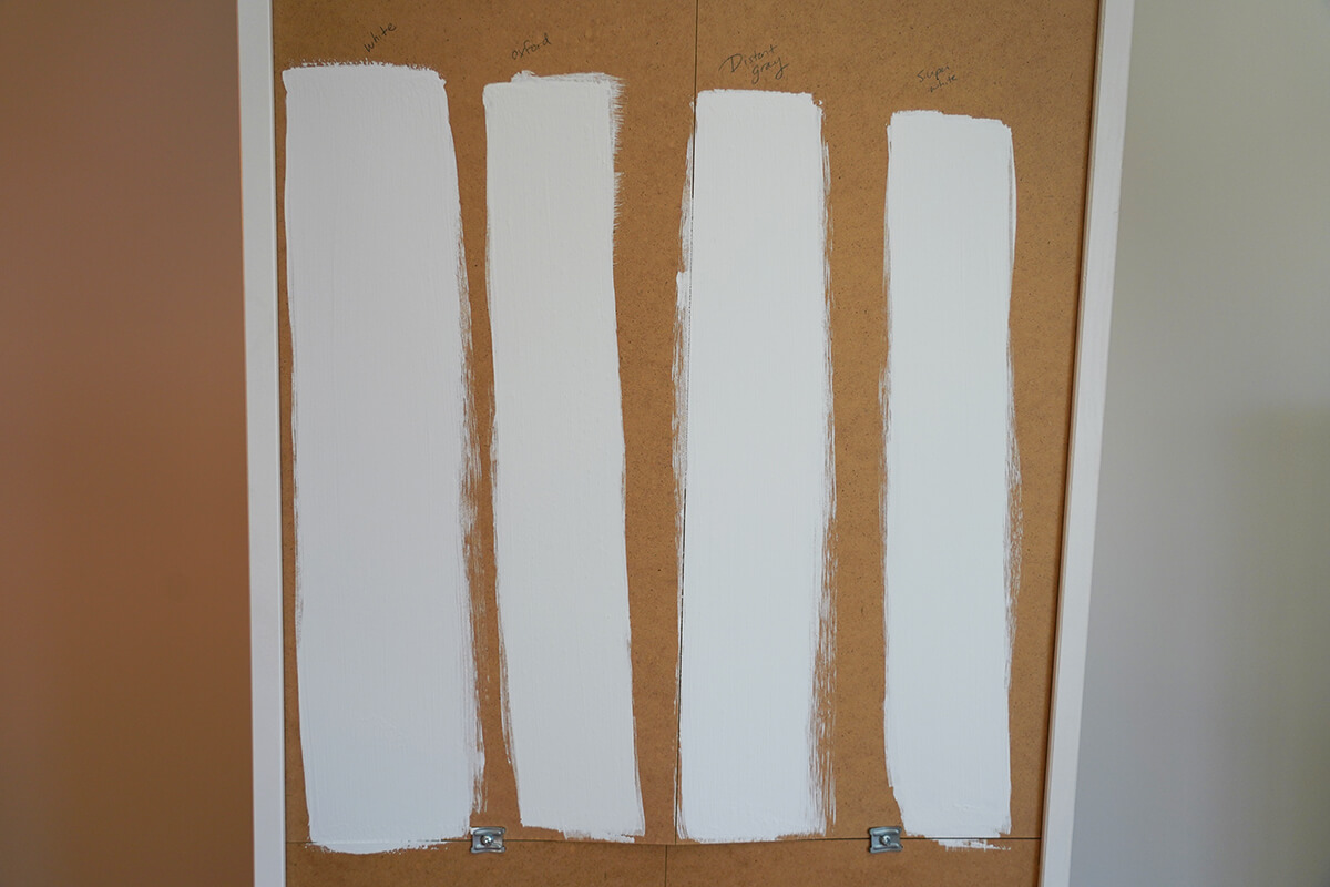
As you can see from the photo below, Distant Gray and Super White are very similar.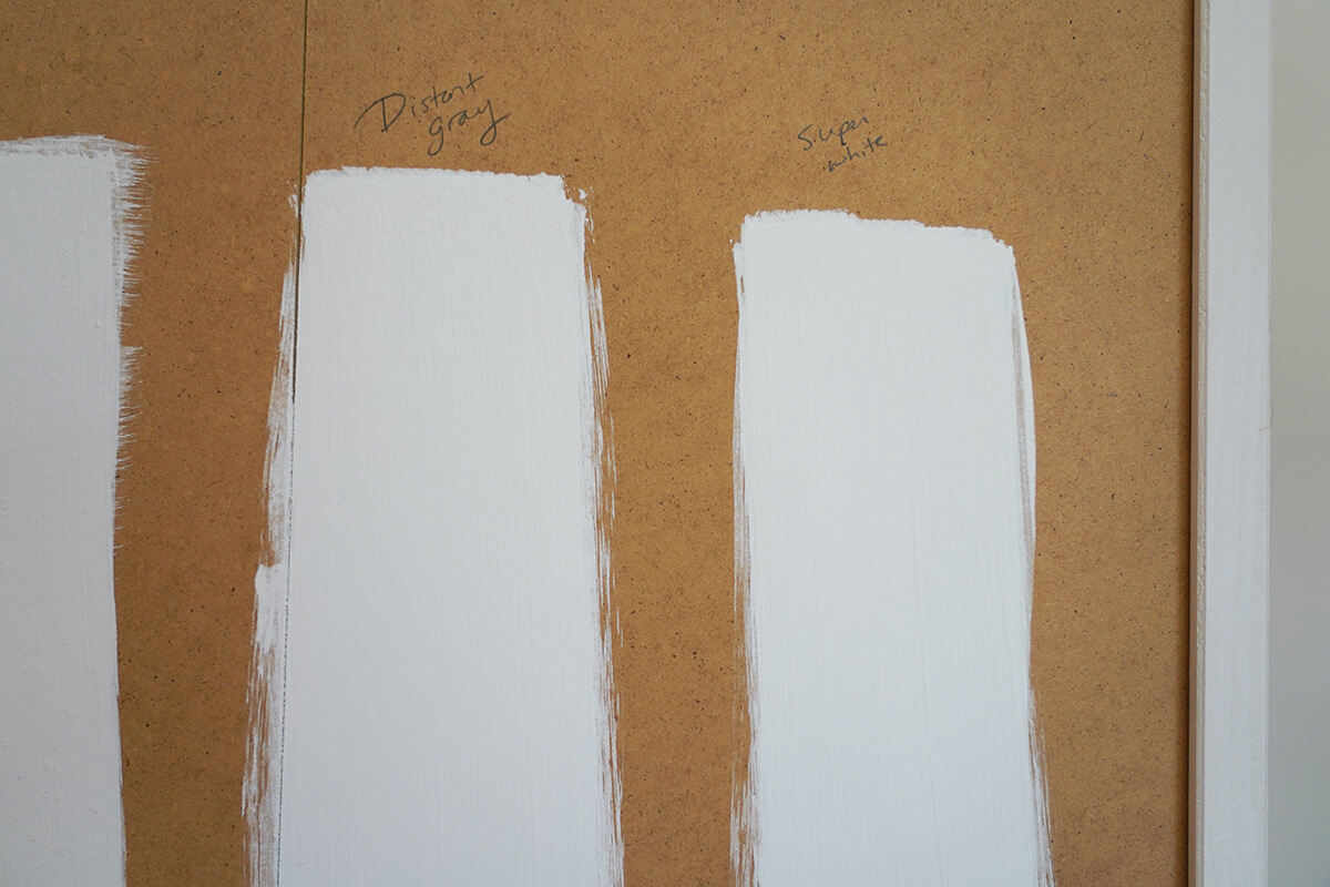
FINAL DECISION
So in the end, what did I decide to go with?
Super White.
Overall, the neutral undertones won out and I liked the fact that it just. looks. white. Also, seeing it in the light of day, I didn’t feel like it was too bright.
We won’t see the finished product for at least a month or two, until our cabinets and built-ins are installed and our trim and doors are painted, but I’m confident in my decision. At least for now … hehe.
Did you have a similar experience choosing a white paint? What helped you make your decision and what paint color did you go with? Leave me a comment below so we can commiserate together!

5 comments
Hey Meghan!
I am going through the exact same dilemma!
I would love to know how the cabinets turned out. I’m currently between Oxford White, White Dove, and maybe now I’ll consider Super White!
Hey Rebecca! Our cabinets and trim turned out amazing … After all that back-and-forth, I’m so happy we chose Super White. It’s just the white color we were looking for – neutral undertones and not too bright or stark. As I mentioned in the post, I definitely saw green undertones in Oxford White, and if I’m not mistaken, White Dove has more creamy undertones, which is why I stayed away from it. I haven’t held up a Benjamin Moore paint sample card up next to our cabinets but I’m curious to do so!
Hi Meghan,
Wow! I thought I was the only one driving myself and everyone crazy over a white paint for my cabinets being made.I totally feel the same way as you described every color I sampled. I feel more confident to pick super white now. I wanted a neutral white was nervous it would be to stark but by the way you described it I. Going with super white. I. So happy again I came across this. Thank you for all your input.
You’re definitely not the only one Cari! I’m so glad I could help. Honestly, I have zero regrets choosing super white. At some point soon I’ll share some pictures of how everything turned out. It’s perfect for our kitchen cabinets and built ins as well as our trim and doors. It’s definitely not too bright or stark. I love it.
[…] up, we pivoted and opted for Soft Chamois. The new paint color is perfect, especially against our BM Super White trim. In some of my photos, soft chamois reads more yellow than it does in person. It truly is a […]